When leadership coach Nita Sharma first approached me about redesigning her website, she had a very clear idea of the design brief.
Nita was looking for a clean, simple, modern design that accurately reflects her leadership coaching business today.
Her existing site had been online, unchanged for many years. It had served its purpose well, but like many long-standing professional websites, over time the design had aged and the content described an earlier stage of her work.
So the goal for a new site was pretty straightforward: create a modern, focused website that reflects her work as an executive and leadership coach.
What followed was a leadership coaching website design project that focused as much on messaging and positioning as it did on design.
The starting point
Nita’s previous website contained a wealth of information. The challenge was not that the site lacked substance. If anything, the opposite was true: there was far too much content and much of it was out of date.
Over the years, Nita’s career had included diversity consulting, leadership development work, executive coaching and organisational consultancy. All of those experiences continue to inform what she does today, but on the website they appeared side by side without a clear hierarchy.
For someone visiting the site for the first time, the answer to a fairly important question was very hard to find: What exactly does Nita do now?
This situation is common for experienced consultants and coaches. As careers and specialisms develop over the years, websites often become a record of everything that has ever been done rather than a clear reflection of the work being offered today.
Our coaching website redesign project began by addressing exactly that question.
Getting clear on the who, what, and why
Early conversations focused on how Nita’s work had evolved in recent years. I like to get a really good idea of who my clients are, what they do, and why they do it. It’s incredibly important for me to understand where they’re coming from in order to get the positioning and messaging just right.
Although Nita works with individuals as well as organisations, much of her work now comes through organisational clients. Senior leaders, HR professionals and leadership teams are the people most likely to seek her out.
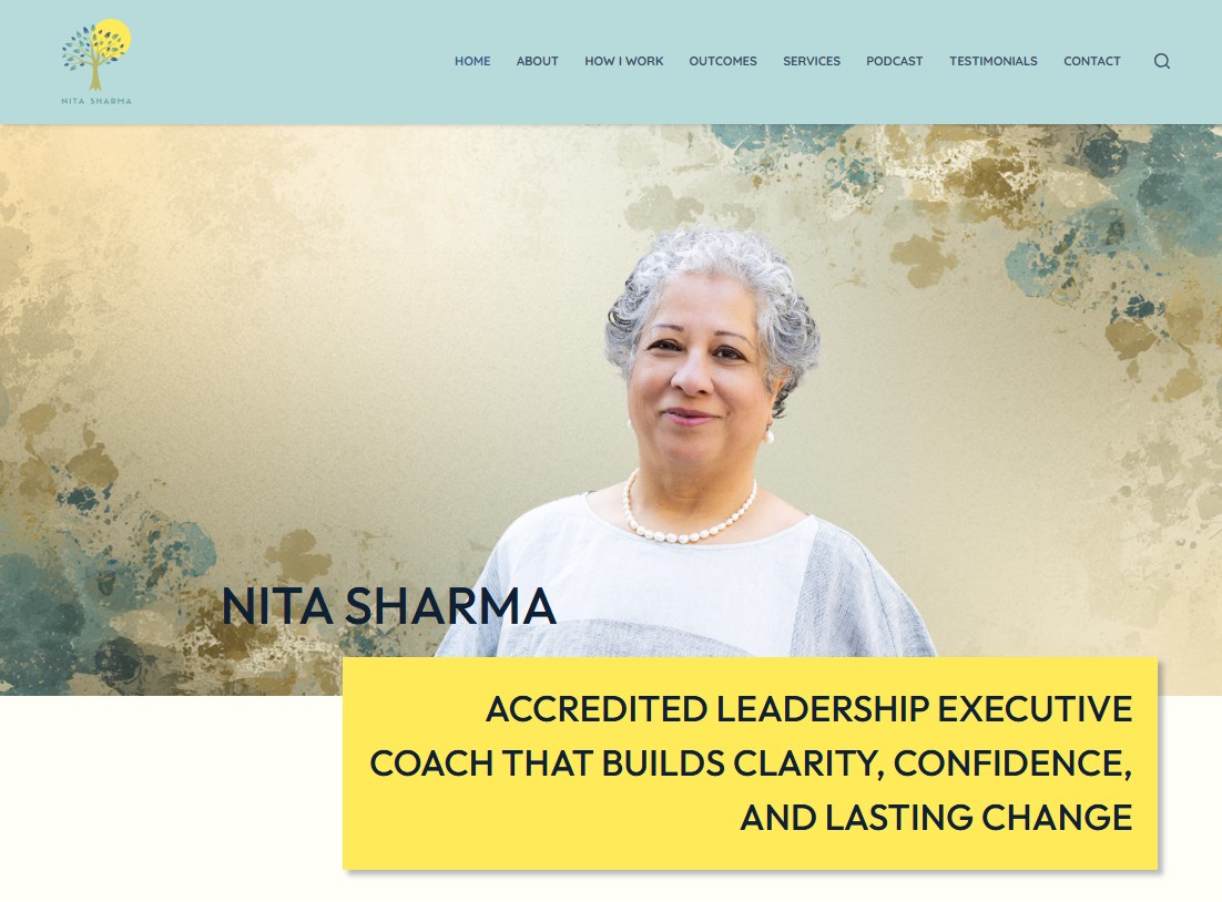
Once that was clear, the positioning of the website became far simpler. Instead of describing each and every strand of her professional background, the site would lead with a clear identity: Executive and Leadership Coach.
Supporting services such as group coaching, supervision and action learning would sit underneath that central message.
The language throughout the website emphasises the themes that underpin Nita’s work: partnership, collaboration and helping organisations develop stronger leadership capability. With that key piece in place, the structure of the new site began to take shape.
Choosing a one-page website
Professional service websites have a habit of growing organically and becoming unnecessarily complex over time. A proliferation of pages and duplicate information muddy the waters and make it much harder for visitors to understand the business.
For this project we decided on a very different approach.
The new home for nitasharma.com was designed as a focused one-page website that guides visitors through a simple narrative. It introduces Nita and her work, explains her coaching approach, outlines the services available and ends with a clear invitation to make contact. It’s a sharp and punchy editorial piece, not an epic saga.
This structure works particularly well for leadership coaching websites because visitors are generally looking for a quick sense of credibility and fit. They want to understand who the coach works with, how they approach their work, and whether the style resonates with them. In short, a coaching website needs to have personality.
A single, well-structured page allows personality to shine and the story to unfold naturally.
Designing a calm, confident presence
With the structure and text content agreed, the visual design could begin. This is without doubt my favourite part. I love words, but blending in colour, imagery, and interaction is what brings stories alive on the internet.
The intention was never to create something gaudy or attention-grabbing. Leadership coaching is built on reflection, thoughtful dialogue, and careful listening. Nita’s website needed to mirror that tone.
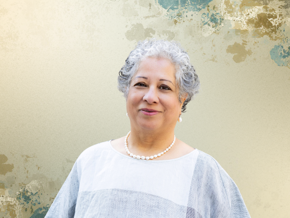
Using Nita’s photography and colours inspired by her Reaching Minds podcast branding, the design introduces subtle flowing backgrounds and a clean layout that allows the content to breathe.
During the first design review we reviewed a number of different treatments and made several adjustments to improve the feel of the page. Some sections initially felt slightly blocky, so the flowing background from the header was extended further down the site to create a smoother visual rhythm.
We also reviewed the icons used to represent different services. One icon originally chosen for supervision raised concerns about accessibility, so it was replaced with a more inclusive symbol representing a safe space for reflection and learning.
Small decisions like these help inform the final design and ensure the website reflects the values of the person behind it.
The technical work behind the scenes
Even a relatively simple website involves more technical work than most visitors realise.
Alongside the design and content development, the build included configuring secure contact form delivery, ensuring the layout worked cleanly across mobile devices and integrating Nita’s podcast directly into the page.
Cyber security affects everyone so I also install basic security features as standard with my builds. Simple things like 2FA, firewall, and scheduled backups all make a difference and shouldn’t be overlooked.
Finally, once the site is live, I always offer 2 weeks post-launch support to my clients. During this time, we fix any minor content issues and, more importantly, make sure old pages are redirected to maintain existing SEO authority.
The aim was to keep the visitor experience simple while ensuring the website functions reliably as a professional business tool.
Before and after
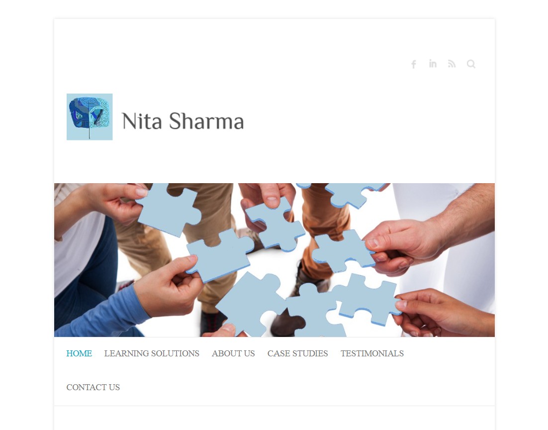
Looking at the two websites side by side highlights the difference very clearly. What a change in tone and temperature! From faceless corporate to the warmth of Nita’s true personality.
Yes, the previous website reflected many different strands of Nita’s professional journey. But while it contained valuable information, the overall message was less focused and visitors needed to spend time navigating through multiple pages.
The new site brings that story into a single, coherent narrative. It’s clearly focused on her core offering: executive and leadership coaching, and it simplifies the structure and makes it easy for visitors to understand the services offered.
Most importantly of all, the website now reflects where Nita’s practice is today rather than where it began.
What makes an effective leadership coaching website?
This project highlights a few patterns that pop up again and again when designing websites for coaches and consultants.
Most notably, leadership coaching websites work best when they focus on clearly articulating personality. In my experience working with coaches, one of the biggest questions people ask is: Will I get on with them?
Visitors arriving on a coaching website also want to know:
The strongest coaching websites usually include a few essential elements.
These principles guided the design of Nita Sharma’s website and are often the difference between a site that exists and one that actively supports a thriving coaching practice.
Thinking about updating your own coaching website?
Many of the website projects I work on begin with the realisation that your website no longer reflects the work you’re doing today. The design might feel dated, the messaging unclear or the structure simply no longer fits the direction of the business.
Don’t panic! The solution isn’t always starting from scratch with a complete rebuild. Sometimes the biggest improvements can come from working on the content to tighten the positioning and simplifying the website structure.
If you’re considering a leadership coaching website design project of your own, you know where I am!